Welcome emails are right up there with the most important emails you’ll send to a customer.
Why? Because it’s your chance to let your new customer know who you are and what your business is all about. More importantly, it’s a way for you to clearly outline what your product or service is going to do for them (and how it’s going to make their life better).
The good news for companies is that welcome emails are opened more frequently than almost every other type of email. According to GetResponse’s latest Email Marketing Benchmarks report, over 82% of people open a welcome email when it lands in their inbox. However, just under 23% of those readers end up following through on the email’s call-to-action.
Which means emails are being opened, but people aren’t compelled to take the next step. In this post, we’re going to look at:
- What welcome emails are in detail
- What makes a good welcome email
- How to get someone to take action after reading a welcome email
- 9 examples of great welcome emails
What’s a welcome email, and who is it for?
A welcome email is the first email a new customer or subscriber will receive from your business.
They’re designed to introduce you and help someone who’s new to you navigate how to gain value from your product or service.
Welcome emails are also a good way to educate your customers on the key benefits they’ll receive from you, and if done right, can drive long-term customer engagement and retention.
Done right, a welcome email can do so much more than just say hello. It can be used in a bunch of different scenarios:
-
- A welcome email right after subscription
- Telling subscribers about the benefits of joining your mailing list
- Doubling as a user-onboarding email that introduces how to use your product
- A welcome gift, such as a discounted subscription or coupon offer
- An email that also develops a relationship with the customer
Welcome emails are one of the most effective ways to get your message across because of their high read rates, which are 42% higher than the average read rate for all other types of emails.
What makes a good welcome email?
Not all welcome emails are equal.
Facebook’s VP of Growth, Alex Schultz, defines a welcome email as the moment when your user thinks “Aha! So that’s what this product can do for me.” Getting this right often involves including three core pieces:
- A reminder about who you are and how your product can help them
- An explanation about what to do next and why they should do it
- A single call-to-action
Welcome emails tend to have a consistent structure. They’re usually short; a Customer.io study of 50 welcome emails found 65% of welcome emails range from 50–150 words in length. If you can, you should also try to send personalized emails—a HubSpot study found that welcome emails that are personalized have higher click-through rates.
A lot of welcome emails are now automated, too. Thanks to email marketing templates and tools like Mailchimp, companies can trigger welcome emails to automatically send whenever a new subscriber or customer enters their funnel. Every interaction a customer has with the email is tracked, so when they open it or click on a call-to-action, you’ll get a notification.
Some email platforms, like Mailchimp, even hook up to team instant messaging platforms to automatically notify everyone on the team when emails have been sent out and if people subscribe or unsubscribe. Here’s an example of how that looks:

There are two main ways you can personalize your emails, through the name and content:
- Name personalization: Either in the subject line or in the content of the email
- Content personalization: Sending content that reflects what you know about the customer so far, like their download history, company name, or job position
Let’s take all of this and outline the anatomy of a good welcome email.
Step 1: Make it recognizable
Your customer’s inbox is a busy place, so the first mission of your welcome email is to make it recognizable.
Make sure your brand can be identified the moment the email is received. Everything from the colors and icons in the email to its tone of voice can help communicate your company’s message.
Step 2: Introduce yourself
Your first email is the perfect time to start building a relationship with your new customer or subscriber.
Remember the stats from earlier about email length and make sure to keep it short and sweet. It should also only have a single call-to-action—don’t give your reader too many choices and things to click to as it might be too confusing and just cause choice paralysis.
Step 3: Include your social media channels
There’s a reason welcome emails are more engaging than others: people are interested in your brand and the new relationship they’ve just entered into.
Use this interest to encourage curiosity around your business by including links to social media channels in your welcome email. Not only will it give your reader a chance to learn more about your company, but it will also help boost your online following.
But remember, keep it subtle and don’t let the links divert attention from your main call-to-action in the email. Canva does a great job of doing this by placing their four main social media channels discreetly at the bottom of their welcome emails:

Step 4: Offer a gift
Finally, consider offering up a discount or a coupon as a welcome gift to your new customer or subscriber.
The main goal of a welcome email is to create a foundation that will allow you to build a long-term relationship. Adding an offer or gift can help cement that by making your reader feel like purchasing or subscribing was the right choice. Think of it as a goodwill gesture in your first interaction that’ll get them talking about your brand positively to their friends and colleagues.
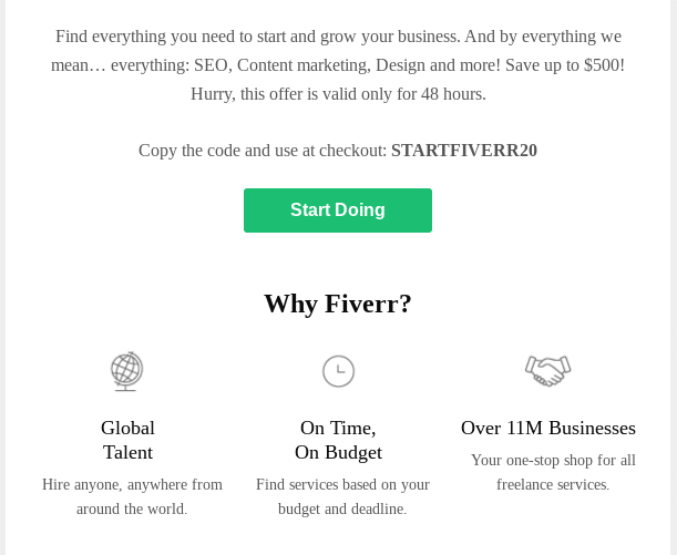
Freelancing site Fiverr welcomes new email subscribers by offering them 20% off their first order. The email also sticks to the 150-word rule and reinforces why the company is a good choice with the “Why Fiverr?” section:
A welcome email is also the perfect spot to highlight a referral program (if you have one). For example, at RingCentral, we have a referral program where each customer gets a $100 eGift card for every referral that becomes a customer. All you have to do is create a referral account and share your personalized URL with friends, peers, and colleagues:
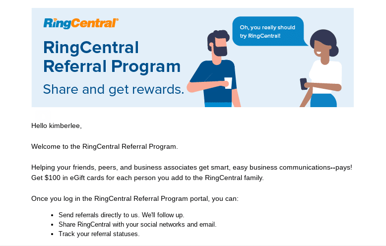
If they respond, we contact them directly, which makes it easier for current customers to participate. We like to call it a win-win situation.
Pro-tip:
While the anatomy of a perfect email may seem simple to get right, it’s important to know the parts that you should leave out. Companies that make costly mistakes in a welcome email (no matter how small) risk the reader clicking the “unsubscribe” button.
Some of the key mistakes companies make when they send out their welcome emails:
- Badly designed, non-responsive emails that don’t work across multiple devices
- Sending more than one at a time (spam alert!)
- Making them too long (save those for when you’ve built up a relationship)
- Not having a clear call-to-action or path you want your reader to take
- Including more than one call-to-action, which can make things confusing
- Overloading your reader with too much information and overwhelming them
Now that we know what your welcome email should look like, let’s take a look at how to get someone to take action after reading your email.
Step 5: Get the reader to take action
Apart from making your new customer or subscriber feel a connection with your brand and building brand awareness, the most important part of your welcome email is its call-to-action.
Your call-of-action has one job: to get someone to do what you want by telling them clearly and directly. A call-to-action can be as simple as “Read this blog” or “Watch this training video,” or it could be more direct like “Download the app” or “Sign in to dashboard.”
When thinking about what you should use as your call-to-action, maximizing your product’s impact should be a top priority. Buffer, a social media management software company, does an awesome job at not only welcoming new customers with open arms, but also getting them to take the first step in using their product from the very first email.
First off, they make the first half of the email very welcoming by letting the customer know they’re now a part of the Buffer family. Then, there are hyperlinks that direct the customer the two best avenues to reach out to for support:

The email’s call-to-action then encourages you to download the tool’s browser extension. This has two purposes. Number one, Buffer wants to capitalize on the interest the reader has shown in their product by getting them to start using it right away. Two, it also shows the customer that their product works in different ways—and that Buffer is easy to incorporate into their existing internet browsing habits:

They’ve doubled down on this narrative by using phrases like “take Buffer with you anywhere” and “share awesome content in a flash.” If you’re a professional, the extension call-to-action will probably fuel your curiosity about how Buffer can help with your busy schedule.
With this in mind, let’s take a look at 9 companies who have got their welcome emails down to a fine art.
5 examples of welcome emails for subscribers
Firstly, let’s look at the companies who welcomed their new subscribers. These emails are usually sent after someone has subscribed to an email newsletter (more on how to create newsletters here) or downloaded content such as an eBook.
A more personalized sign-off: The content in the email is written in a way that sounds like somebody from AdEspresso has personally sent it (i.e., “let me know if I can help any further”). They could take this a step further and have an individual team member’s sign-off or signature on the email. They could even send the email from a personal account, like the team over at Drift:
1. AdEspresso’s welcome email

What they got right:
AdEspresso‘s welcome email is strongly branded, making it instantly recognizable. The email’s bright design and branding make it easy for their customers to pick out in their inbox.
Apart from standing out, AdEspresso has managed to pack a ton of information into just a few sentences. They provide a link to download the guide (just in case the new customer loses their copy of the file), and they also added links that make it easier for the receiver to share the content around on social media.
The devil is in the details with this email. The company makes it clear that the eBook has no strings attached, and will help the reader master social proof marketing (which basically means using testimonials, reviews, and other forms of “social proof” to convince people to buy from you).
What can be improved:
- A clearer call-to-action: The link to the eBook could be more pronounced, maybe in a different color or some kind of visual box callout.
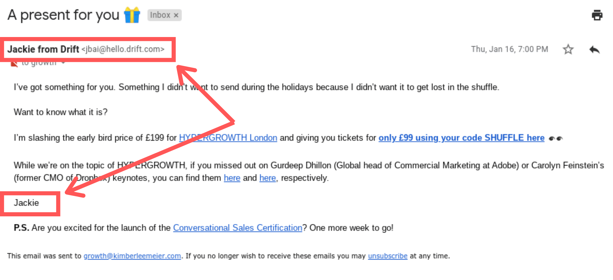
- A more personalized sign-off: The content in the email is written in a way that sounds like somebody from AdEspresso has personally sent it (i.e., “let me know if I can help any further”). They could take this a step further and have an individual team member’s sign-off or signature on the email. They could even send the email from a personal account, like the team over at Drift:
2. HubSpot’s welcome email

What they got right:
HubSpot has always been a leader in positive, proactive messaging—and their welcome emails are no different.
They have different welcome email sequences depending on the source (like subscribers, product purchases, and eBook downloads). Yet their goal is clear: to inform new subscribers about the benefits and possibilities of HubSpot.
In this welcome email, they use two clear sentences to pitch their mission (to help people and companies grow), and then, outline how they’re going to do it. Most importantly, the email has a clear call-to-action at the bottom, where new customers are invited for a free demo of how HubSpot’s software will make that mission a reality:

What can be improved:
- No social media links: HubSpot don’t include any links to their social media channels on their welcome emails. However, this may be to keep people focused on what they want them to do: book a demo.
- Personalization: Although the emails are personalized by including the subscriber’s name, they are still sent from a generic @hubspot.com email address.
3. Medium’s welcome email

What they got right:
First of all, the email is super personalized because it even includes a headshot of the new customer. If your company allows customers to sign up using Google or Facebook, it’s likely you’ll have access to a personalized photo, so mimicking this strategy is easy. Following the personalization theme, the email is also signed off by a real human being:

What can be improved:
- The subscriber is thrown in the deep end: Medium seems simple on the surface. However, the email doesn’t really describe to the new subscriber how to use their product. Although it does a great job of describing the positives of the product, touching on how to use the platform could be helpful.
4. Hunter.io’s welcome email

What they got right:
Hunter.io helps you find email addresses using domain names, so it’s no surprise their welcome email is an example of how it should be done. For starters, the company enforces its social proof (1.5 million people are using them, so they must be doing something right). Then, they start with a single easy step to introduce you to their tool: download its Chrome extension.
That’s it. No blog links, no upsells. All they want is for their customers to see how the tool will be able to help you uncover verified email addresses.
What can be improved:
- Personalization: Once again, this welcome email lacks personalization. It’s sent from a generic Hunter.io address, and there isn’t a sign-off either.
- Explanation: Highlighting that their tool can pull email addresses using a single domain name would’ve been a nice touch that wouldn’t have put their word count over the edge.
5. Vistaprint’s welcome email

What they got right:
Vistaprint’s welcome email offers an immediate reward for its new subscribers: a discount voucher. It’s important to peel back the thinking behind offering this in the company’s very first email. Firstly, new subscribers may have entered their email into Vistaprint’s database without making a purchase at all. This email is a way to woo them and turn them into a happy customer.
To make this offer slightly less transactional, Vistaprint has positioned it as a limited-time discount as a reward for signing up. Offering the discount in this way signals their appreciation to the new subscriber without making it all about securing a sale.
What can be improved:
It doesn’t say much: The main point of the email is to offer the limited-time discount, which is smart. However, when it comes to explaining Vistaprint’s product offerings, the welcome email falls a little short.
4 examples of welcome emails to new customers
Next, let’s look at how companies welcomed new customers. These emails were sent after someone signed up to a company’s freemium or paid product.
6. Ahrefs’ welcome email
What they got right:
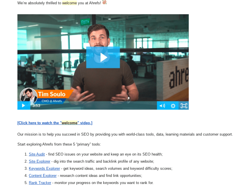
This is the first welcome email on the list that has a welcome video. Ahrefs have been pioneers of testing out new ways to interact with their customers and helping them understand their product, so this isn’t surprising. (It’s not quite sophisticated enough to be considered “interactive content,” but still pretty engaging.) The company’s CMO, Tim Soulo, breaks down Ahrefs’ primary tools in the video, which is accompanied by screenshots.
Including this in a welcome email means that someone who’s new to Ahrefs can constantly refer back to it if they get stuck when they’re testing it out. Plus, if you reply to the email, you’ll get an answer from Tim himself. Pretty cool customer experience.
What can be improved:
- There might be too much going on: Anybody who has ever interacted with Ahrefs knows the company has a treasure trove of extremely useful content. However, the email is asking the new customer to do a lot of exploring in its first email. It could be a little overwhelming.
7. Airtable’s welcome email

What they got right:
Airtable’s welcome email is all about communicating their brand. The colors and language are working in complete unison to communicate the company’s vision, and the video lays out, in simple terms, how Airtable will make it easier to organize your business. (Which is especially useful if you’re managing a small business.)
However, apart from the video, there’s no next step for the new subscriber to take. Apart from watching the video, what should they do?
What can be improved:
- A clearer path: Like Ahrefs’ video, the Airtable call-to-action pulls the new customer away from the email and into a different viewing window. However, it’s not exactly clear where you should go from the video. The video needs to create a clearer path, like downloading their desktop app, for example, to help their customer continue down their onboarding journey.
8. Moz’s welcome email

What they got right:
Right away, new customers are welcomed into the Moz community and made aware of what their freemium membership will get them. The welcome email also has brief descriptions of the main features of the freemium version of the tool, including a Chrome plugin, keyword targeting, and access to Moz’s reward program.
The part of the email that’s most interesting, though, is its call-to-action at the end of it. Instead of offering a 1-on-1 demo, which is what most companies do but can be intimidating, you’re given a link to explore other upgrade options on your own terms:

What can be improved:
- It’s too long: Moz’s welcome email is well over the 150 word limit of the majority of welcome emails. Of course, they might have tested this email and found that most people actually read it all the way through and click on the CTA, in which case… this is fine! It’s always important to test your emails.
9. Asana’s welcome email

What they got right:
Asana’s welcome email mirrors the main role of their product: a task management checklist. The email’s branding is contrasted with whitespace, which helps the checklist stand out even more.
It’s also easy to digest. Once you’ve signed up, you’re offered three quick tips on how to use the main features of the tool. As Asana is a software as a service (SaaS) tool, the checklist is a way to approach the learning curve in a simpler way. Once the “Get Started” call-to-action is clicked, you’re redirected to an onboarding session to help you use the tool right out of the box:
What can be improved:
- Where’s the customization?: The welcome email is very much a one-size-fits-all affair. Although it ticks all the boxes in providing information, it’s still quite generic considering Asana collects your company name and job description when you sign up. Including a personalized detail about the reader would make this email a solid 10/10.
It’s your turn to stand out with your welcome emails
Your welcome email is arguably the most important introduction you’re going to make to new customers and subscribers.
It does so much more than just say hello. A welcome email should be the first brick you lay in building a relationship with your customers that makes them feel at home. It should also give them a sense of what your product or service is all about and create a clear path for the next step they should be taking in their customer journey.
Crafting the perfect welcome email requires a little bit of trial and error. However, once you get the formula right, the perfect welcome email allows your brand to stand out above the rest in your reader’s inbox.
Updated Mar 13, 2025
